Additive vs Subtractive Systems
Which colors can we reproduce with these additive and
subtractive systems?
Now, we have already understood that the CMYB system cannot
reproduce as many colors as the RGB system, and that the CMY system
is even less good. In other words, the more you add colors to the
CMY system, the better it becomes. And so, if you can work with not
only the primaries Cyan, Magenta and Yellow, which cannot be
perfect, but also with excellent Blues, Greens, Reds, etc., the
result will be dramatically better.
(Back to top)
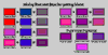
An example
And that is precisely the case nowadays when painting in
oils. I give you an striking example on figure #6:
Click on the thumbnail for more explanations and
getting a bigger image
The lesson of this for a painter is that each
time you mix two pigments you get less bright colors. The only
exception is mixing yellows with Viridian or Phthalo Green for
getting yellower greens. Even mixing red and yellows cannot give an
even bright orange as Cadmium Orange.
(Back to top)
Which colors can every system reproduce?
Now follows a series of diagrams showing which colors every
system can reproduce.
Click on the thumbnails for explanations and
bigger images
(Back to top)
Conclusion
It’s impossible to reproduce all the colors of the nature
with any color system and even it isn’t possible to reproduce
with any system all the colors of another color system.
On the Web, we utilize the RGB system. It’s probably the
best color system, but it is unable to reproduce all the colors of
an oil painting. If you print an image taken on the Web with your
personal color printer, the result will be even poorer and less
bright than the original image.
When you see on your screen a reproduction of an oil painting,
there is already a loss of colors by comparison with the original,
even if the screen image can sometimes appear more luminous than
the original painting — this is particularly the case with
very dark paintings like some masterpieces of e.g. Leonardo da
Vinci, Diego Velasquez, Rembrandt or Georges de La Tour (and many
others). But if you print what you see on your screen, the printed
image you’ll get will be even further removed from the
original.
Fortunately, the human eye can compensate these color losses to
a certain extent, so that the final result can often be less bad
than theoretically expected.
Sorry, but it’s physically impossible to do better
with today’s technical means.
Next two pages will examine the issue of the grays and the
browns.
 |
 |
 |
 |
 |
Copyright © 2001 Sea Ooh
See
All Rights Reserved |