Pigments No.3
(Back to Figure
#10)
What about painting with Primary Colors?
Important note
This page is devoted to the choice of a
palette, as far as the best depiction of colors is concerned. In Pigments No.2, the same problem has
been examined on another point of view: the best permanency of the
pigments. This explains some differences in the choice of the
pigments.
Painting with primary colors is a very good school exercice.
However, it is impossible to reproduce all the colors with such a
method. (See Subtractive Systems,
What about the Painters?)
Mixing primary colors for making ochres and browns is an
excellent exercise for learning to mix the colors, but:
- it’s very difficult to obtain precisely the wanted shade
and
- it’s absurd as far as permanence is concerned, because the
natural and synthetic ochres and browns (earth pigments and
synthetic iron oxides) are the most permanent of all known
pigments.
(Back to top)
Which are the best primary pigments?
In fact, there exists no perfect primary pigment. Personally
speaking, I consider that, for such type of painting, permanence is
more important than excellent primary qualities. Why? Because, for
good oil painting, you need to know perfectly how the pigments
react to each other. Learning to mix good primary (but not
very permanent) pigments C and D correctly is a nonsense if later
on you will use nearly primary (but permanent) pigments A
and B only.
In addition, for a good depiction of colors when painting in
oils, you need white and black too, like the printers who use three
primaries plus the white of the paper and a black ink.
When you limit yourself to three primaries plus black and white,
the more transparent these primaries are, the better it is.
That’s why I prefer (Transparent) Chromophytal Yellow PY128 to
Cadmium Yellow Light PY35.
So, the best palette *) **) for painting with nearly
primary permanent pigments is:
*) The colors of all the tables below are approximate.
It´s indeed impossible to guarantee an accurate
representation of colors on the screen, which depends on the
adjustment of every monitor.
**) Perfectly seen with NeoPlanet 5.2, Internet
Explorer 6.0, Netscape 6.2 or Opera 6.0, . Some older browsers
don’t show the colors of these tables correctly (or even
don’t show them at all).
| ¶¶ |
Titanium White PW6 |
|
| ¶ |
Chromophytal (Transparent) Yellow PY128 |
|
| ¶ |
Quinacridone Rose PV19 |
|
| ¶+ |
Phthalocyanine Blue PB15 or PB15:1 |
|
| ¶¶+ |
Mars Black PBk11 |
|
Note:
Not every oil colors manufacturer can sell you
PY128. Some brands propose another organic yellow as a Primary
Yellow, like PY1, PY3, PY153, etc. But
- either these pigments are often partially transparent,
- or they are not sufficiently permanent (according to my
personal lightfastness tests) and, for this reason,
- do not belong to the final list of the best pigments I propose
for painting in oils.
That’s why the second choice for painting with nearly
primary permanent pigments is:
| ¶¶ |
Titanium White PW6 |
|
| ¶+ |
Cadmium Yellow Light or Pale PY35 |
|
| ¶ |
Quinacridone Rose PV19 |
|
| ¶+ |
Phthalocyanine Blue PB15 or PB15:1 |
|
| ¶¶+ |
Mars Black PBk11 |
|
(Back to top)
A Six or Seven Primaries Palette?
With the above 5 pigments palette, getting lemon yellow or a
good violet is impossible. Very bright reds and oranges are a
problem too. But the greens are rather good. For better practical
results, most books recommand a 6 Primaries Palette (2 yellows, 2
reds, 2 cyan/blues). But personally, I recommend you to work with 7
nearly primaries. With Ultramarine Blue you can get rather good
violets, and with Cadmium Red Medium you have a brilliant red, good
for getting bright oranges too.
You need two yellows: a greenish one and a pure
“yellowish” yellow, even a very little bit
“reddish”.
An option should have been to replace Transparent Yellow PR128
by Cadmium Yellow Light or Medium (depending on the brand —
see note 1 in Pigments No.2),
because the latter is the main yellow pigment of a normal palette,
and because one has to become accustomed with working with it. And
indeed, in normal painting, Transparent Yellow may not seem so
useful, because it’s often reserved for final glazes.
Nevertheless, I’ve preferred to preconize a 7 Primaries
palette containing 3 yellows: Cadmium, PR128 and a permanent Lemon
Yellow, Nickel Titanium Yellow PY53, which is not so bright as
Cadmium Lemon PY35, but which is more permanent and can give very
fine greens when mixing it with Phthalo Blue. The main reason of
keeping Cadmium Yellow Medium (of Light) and PR128 together in the
palette is that a transparent and an opaque yellow don’t work
the same way in the mixtures.
Try to mix Phthalo Blue, Ultramarine or Black
with these 3 yellows and you’ll immediatly understand the
differences. Later, when you’ll add the greens (Phthalo Green
and Viridian) to your palette, make the same exercize again.
It’s amazing how you will learn about mixing fantastic greens
from this way of working.
| ¶¶ |
Titanium White PW6 |
|
| ¶¶ |
Nickel Titanium Yellow PY53 |
|
| ¶+ |
Cadmium Yellow Light or Medium PY35 |
|
| ¶ |
Chromophytal (Transparent) Yellow PY128 |
|
| ¶+ |
Cadmium Red Medium PR108 |
|
| ¶ |
Quinacridone Rose PV19 |
|
| ¶+ |
French Ultramarine PB29 |
|
| ¶+ |
Phthalocyanine Blue PB15 or PB15:1 |
|
| ¶¶+ |
Mars Black PBk11 |
|
(Back to top)
A good reduced palette for learning to mix colors (11
colors)
To get more easily ochres and browns, I have added to the above
palette an Ochre and an all-purpose Brown: Burnt Sienna. (For
getting dark browns, it’s easy to mix Burnt Sienna with
Ultramarine and/or Black.) We are now coming to a 11 colors
palette.
| ¶¶ |
Titanium White PW6 |
|
| ¶¶ |
Nickel Titanium Yellow PY53 |
|
| ¶+ |
Cadmium Yellow Light or Medium PY35 |
|
| ¶ |
Chromophytal (Transparent) Yellow PY128 |
|
| ¶+ |
Cadmium Red Medium PR108 |
|
| ¶ |
Quinacridone Rose PV19 |
|
| ¶+ |
French Ultramarine PB29 |
|
| ¶+ |
Phthalocyanine Blue PB15 or PB15:1 |
|
| ¶¶+ |
Mars Black PBk11 |
|
| ¶¶+ |
Yellow Ochre PY43 |
|
| ¶¶+ |
Burnt Sienna PBr7 |
|
(Back to top)
A better 13 colors palette for everyday work
Now this reduced palette is not yet perfect. Actually, I should
have replaced Ultramarine by Cobalt Blue, which is more permanent
and has none of the limitations of Ultramarine. But doing that
signifies that we cannot make good violets any longer, unless we
add a permanent violet to this list of pigments. For good greens,
it’s easier to include a green pigment too. That’s why I
now propose the following 13 colors basic palette, with practically
no limitations.
| ¶¶ |
Titanium White PW6 |
|
| ¶¶ |
Nickel Titanium Yellow PY53 |
|
| ¶+ |
Cadmium Yellow Light or Medium PY35 |
|
| ¶ |
Chromophytal (Transparent) Yellow PY128 |
|
| ¶+ |
Cadmium Red Medium PR108 |
|
| ¶ |
Quinacridone Rose PV19 |
|
| ¶¶ |
Manganese
Violet 1,2,3,4 PV16 |
|
| ¶¶ |
Cobalt Blue PB28 |
|
| ¶+ |
Phthalocyanine Blue PB15 or PB15:1 |
|
| ¶¶ |
Viridian PG18 |
|
| ¶¶+ |
Mars Black PBk11 |
|
| ¶¶+ |
Yellow Ochre PY43 |
|
| ¶¶+ |
Burnt Sienna PBr7 |
|
Notes:
- ¶¶ Manganese Violet has a poor reputation among some
painters, because it is sensitive to strong acids and to alkalis,
what prevents its use for painting in fresco, and could be a
problem in watercolors too. But when painting in oils, it’s a
perfectly safe pigment. Perhaps its bad reputation is in relation
with its price too: actually Manganese Violet — being cheaper
than Cobalt Violet — has acted for a long time as substitute
for the latter in some poor quality oil colors.
- ¶¶ Cobalt Violet Dark PV14 (an absolutely permanent
pigment in any circumstances) could have replaced Manganese Violet,
its shade being almost identical to the one of Manganese Violet.
However, I’ve preferred recommending the latter because
it’s easier to work with it than with Cobalt Violet Dark for
getting beautiful mixtures. But you can try Cobalt Violet without
the slightest remorse.
- ¶ Permanent Magenta PV19 cannot be a good replacement
solution, because it has a redder shade, which is not so useful in
this palette because on the one hand you already have Quinacridone
Rose for getting a redder shade by mixing it with Manganese Violet
PV16, and on the other hand mixing Cobalt Blue with Quinacridone
Rose cannot give an as good Blue Shade Violet as
pure Manganese Violet.
- I advise you against Dioxazine Purple (or Violet) PV23.
Actually, my personal trials have demonstrated without any doubt
that this pigment is not very lightfast (see Trials. 3. Alizarine and Dioxazine
Violet).
(Back to top)
The problem of the browns and of the blacks
For getting dark browns I advise you to mix Burnt Sienna with
one of the following pigments: Phthalo Blue, Cobalt Blue, Manganese
Violet, Viridian or even Black.
For getting good blacks, the easy solution used to be mixing
Ultramarine and Burnt Umber. But now many authors prevent us
against the use of these two pigments. The problem is that:
- Natural Burnt Umber (PBr7), owing to its high manganese
content, is a very siccative pigment, what doesn’t matter when
painting in watercolors or in acrylics, but could ruin your
painting when working in oils.
- Ultramarine (PB29) can be bleached by acids or acidic
atmospheres. That’s important when painting in watercolors,
but much less important in acrylics or in oils.
However, as Burnt Umber dries quickly and Ultramarine slowly,
their mixture will dry more or less normally. One can thus think
that the result cannot be too dangerous for the oil film.
- Personally, up till now, I have never had problems with
Ultramarine in oils.
- Neither have I had problems with blacks done by mixing Burnt
Umber and Ultramarine.
But remember to be cautious when painting with these two
pigments. The best thing is to employ them only when it’s
impossible to get the hue you need with other ones, in view of
which you can add these two pigments to your oil palette.
Some manufacturers don’t sell natural Burnt
Umber PBr7 any longer. They have replaced it by mixtures of
Synthetic Iron Oxide PR101 and Mars Black PBk11 (or another black
like Lamp Black PBk6). Sometimes these mixtures are sold under
another name like “(Permanent) Vandyke Brown”,
“(Permanent) Sepia”, etc.
More or less frequently they have a little darker
shade, but this is no problem.
All these “Synthetic” Burnt Umbers can be
used without reservations. But remain cautious and never
buy the following two colors:
- Vandyke Brown when it is a mixture containing non permanent
pigments like Alizarin PR83 or other ones;
- Vandyke Brown PBr8 (a natural earth): it is one of the worst
pigments for painting in oils (it can fade, crack or turn
darker!).
Note: Natural Sepia is the ink
of the cuttlefish. I don’t think it exists in oil color. In
any case, it is a very bad pigment that fades in the light.
(
Back to 16 colors palette)
(
Back to Pigments No.1)
A modern solution for the 21st century
Try to make most of your blacks by mixing Phthalo or Cobalt Blue
with Burnt Sienna. In any case you will get deeper blacks (= more
transparent) than the ones you could obtain with any pure black
(Mars Black PBk11, Ivory Black PBk9, Lamp Black PBk6). But it
remains impossible to get a neutral black, what is very easy
with Ultramarine and Burnt Umber.
Since some years, there is another solution yet: if you mix
Indanthrene Blue PB60 with Burnt Sienna PBr7, you can very easily
reproduce the brown shade of Burnt Umber. If you add a little more
blue (Indanthrene or even Ultramarine) to the mixture, you
immediatly get superb blacks! And so, for getting blacks, you
don’t need Burnt Umber nor Vandyke Brown in your palette any
longer.
Other advantages of Indanthrene Blue are:
- It’s a transparent pigment so that its mixtures with Burnt
Sienna usually give deeper blacks than any mixture of some other
blue with any sort of dark brown (Vandyke Brown or Burnt
Umber);
- Its reddish shade is more suitable for making blacks with Burnt
Sienna than the greenish shade of Phthalocyanine Blue PB15. (Back to Pigments No.2, note 4)
Conclusion
At the present time, the deepest neutral blacks
can be obtained very easily by mixing:
- Either Indanthrene Blue PB60 with Burnt Sienna PBR7;
- Or Ultramarine with a “Synthetic” Burnt Umber.
Note
In any case, the problem seems not to exist any
more for the oil painter who paints with alkyd colors, because
these resins dry so fast that the manufacturer should have been
able to get rid of any significant difference of drying time
between all the pigments.
(back to
Pigments No.2, Natural Umbers)
(Back to top)
An excellent basic palette with 16 colors
So we come to a nearly complete palette of 16 colors. I have
indeed added some very useful pigments like:
- ¶+ French Ultramarine PB29.
- ¶+ Indanthrene Blue PB60.
- ¶¶+ “Synthetic” Burnt
Umber or “Permanent” Vandyke Brown — a
mixture of Synthetic Iron Oxide PR101 and a black like Mars Black
PBk11 or a carbon black (PBk6 or PBk9) seems to be the best choice,
but Burnt Sienna PBr7 plus Ivory or Lamp Black PBk9 or PBk6 (or
other permanent pigments) can do the trick too (see above).
I’ve put this last color in the palette, because a dark brown
is a very useful color for any mixture.
| ¶¶ |
Titanium White PW6 |
|
| ¶¶ |
Nickel Titanium Yellow PY53 |
|
| ¶+ |
Cadmium Yellow Light or Medium PY35 |
|
| ¶ |
Chromophytal (Transparent) Yellow PY128 |
|
| ¶+ |
Cadmium Red Medium PR108 |
|
| ¶ |
Quinacridone Rose PV19 |
|
| ¶¶ |
Manganese Violet PV16 |
|
| ¶+ |
Indanthrene Blue PB60 |
|
| ¶+ |
French Ultramarine PB29 |
|
| ¶¶ |
Cobalt Blue PB28 |
|
| ¶+ |
Phthalocyanine Blue PB15 or PB15:1 |
|
| ¶¶ |
Viridian PG18 |
|
| ¶¶+ |
Yellow Ochre PY43 |
|
| ¶¶+ |
Burnt Sienna PBr7 |
|
| ¶¶+ |
A “Synthetic” Burnt Umber — e.g.
Synthetic Iron Oxide PR101 + Mars Black PBk11 |
|
| ¶¶+ |
Mars Black PBk11 |
|
(Back to top)
Is this reduced palette enough?
For everyday work, certainly yes. Remember that the masterpieces
of the Middle Ages and the Renaissance were painted with limited
palettes too. Even the French Impressionists would have been
delighted with this list of 16 colors. But from time to time you
will need some other pigments for particular effects. However, I
advise you not to be too anxious of trying other colors.
Let’s do a little maths. If you mix together 2 colors in
equal proportions, you only get another one. For example black plus
white can only make gray. Now you have 3 colors. But you can try
various proportions of black and white and get for example a dozen
of different grays. Take now 16 colors and mix them in twos (in the
same proportions), you get 136 colors. It’s already more than
the range proposed by most manufacturers. But if you vary the
proportions, you can get thousands of new shades very easily.
(Back to top)
Some useful advice for successfully mixing colors
- At first, never mix more than two colors at the same time.
- You can do that on oil sketching paper. On the same paper, note
down with a HB or B drawing pencil which colors you’ve used
and let it dry. Always keep the results of your work for later
reference.
This exercise is rather tedious with oils, owing
to their long drying time, but you can do it with acrylics or
watercolors too, (e.g. in a spiral bound sketch book), provided
you use the same pigments as in oils.
- Begin with a palette limited to 3 or 7 primary colors. Try
every possible mixing. (Perhaps you could be surprised to see that
yellow plus black gives olive green.)
- Then you add Yellow Ochre and Burnt Sienna. Mix Ochre with
Black, White and your six primaries; then the same thing with Burnt
Sienna.
- Now try the 11 colors palette and later the 13 colors one in
the same way.
- Then you go to the 16 colors palette.
- Later on, when you’ll handle these mixings perfectly, you
could try to mix 3 colors together.
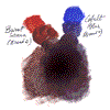
Here you can see the result of such a two colors
mixing on drawing paper.
Click on the image for getting it bigger (77K).
(Back to top)
An extended “basic” palette: 20 colors
Now I think the most useful colors to add could be the following
four:
- Cerulean Blue PB35, particularly for the skies. A
mixture of Cerulean Blue and Ultramarine looks like the Genuine
Lapis Lazuli of the Ancient Masters very much.
- Cadmium Yellow Deep PY35. Very useful for mixing greens
and oranges and for the human flesh.
- Light Red (= English Red = Red Ochre) PR101. Almost
indispensable for the human flesh (of white people).
- A “New Permanent Alizarine”: Permanent Madder Deep
PR264 or Permanent Crimson Alizarine PR177. Useful in the
skies, the draperies, and a mass of mixings.
| ¶¶ |
Cerulean Blue PB35 |
|
| ¶+ |
Cadmium Yellow Deep PY35 |
|
| ¶¶+ |
Light (or English) Red PY101 |
|
| (¶) |
Permanent Madder Deep PR264 |
|
| (¶) |
Permanent Crimson Alizarine PR177 |
|
(Back to top)
Complementary palette
Now you have a “basic”palette of 20 colors.
There’s no point in still talking a long time about new colors
you can add to it. You may try every other permanent color which I
talked about. Perhaps the most transparent ones will be the most
useful, perhaps not. It depends on your way of painting.
Personally, I particularly like the following five pigments:
| ¶¶ |
Opaque Oxide of Chromium PG17 |
|
| ¶¶ |
Cobalt Violet (Light) PV14 |
|
| ¶¶ |
Cobalt Violet Dark PV14 |
|
| ¶+ |
Anthranthrone Red PR168 |
|
| ¶¶+ |
Transparent Yellow Oxide PY42 |
|
 |
 |
 |
 |
 |
Copyright © 2001 Sea Ooh
See
All Rights Reserved |